What’s a home without life and color?
“a: a phenomenon of light (as red, brown, pink, or gray) or visual perception that enables one to differentiate otherwise identical objects
— Color. (n.d.). Retrieved January 10, 2016, from http://www.merriam-webster.com/dictionary/color
b(1): the aspect of the appearance of objects and light sources that may be described in terms of hue, lightness, and saturation for objects and hue, brightness, and saturation for light sources ; also: a specific combination of hue, saturation, and lightness or brightness (2): a color other than and as contrasted with black, white, or gray”
COLOR BASICS
Color is a physical property if physical light (the small area below which we can see with our naked eye).
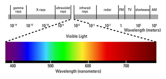
LIGHT PRIMARY COLORS (ADDITIVE)
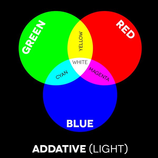
The primary colors for light are Green, Red, and Blue. With the different variations of these three colors, more colors can be created, if combined equally, white can be created). When you work on a computer, many times you are asked to print in “RGB” or “CMYK”, the RGB (Red, Green, Blue) refers to light/computer screens which makes it the best for presentations.
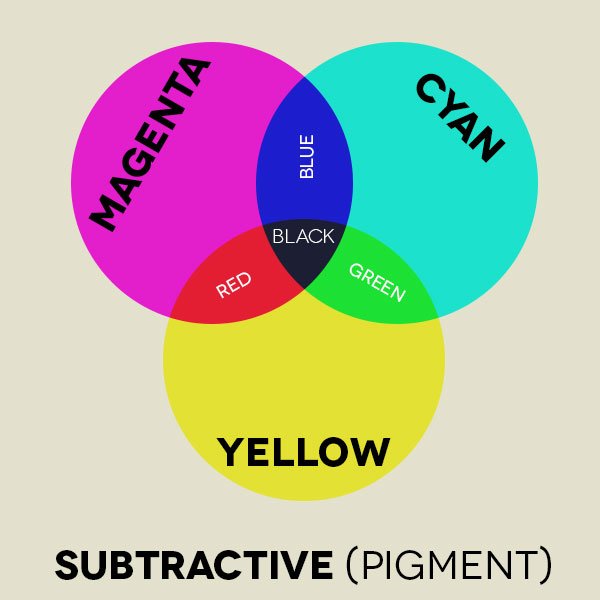
PIGMENT PRIMARY COLORS (SUBTRACTIVE)
The primary colors for pigment are Yellow, Magenta, and Cyan (these are better known as Yellow, Red, and Blue from our elementary art classes). In looking at the “RGB” or “CMYK”, the CMYK (Cyan, Magenta, Yellow, Black) is an option used by printers.
3 COLOR QUALITIES
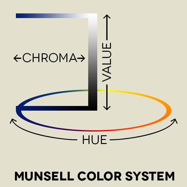
HUE
“: a color or a shade of a color”
— Hue. (n.d.). Retrieved January 10, 2016, from http://www.merriam-webster.com/dictionary/hue
The hue determines the difference between a color; so, we know that yellow is distinguished from purple.
VALUE
a : relative lightness or darkness of a color : luminosity
Value. (n.d.). Retrieved January 10, 2016, from http://www.merriam-webster.com/dictionary/value
b : the relation of one part in a picture to another with respect to lightness and darkness
The value is the degree from white to black, how dark or light the color is.
Color + white = tint
Color + black = shade
Color + grey = tone
CHROMA (INTENSITY / SATURATION)
1: saturation
2: a quality of color combining hue and saturation
Chroma. (n.d.). Retrieved January 10, 2016, from http://www.merriam-webster.com/dictionary/chroma
The chroma (also known as saturation or intensity) is the degree of purity of the hue.
COLOR SCHEMES
MONOCHROMATIC COLOR SCHEME
the use of a single hue, with variations of chroma/saturation/intensity
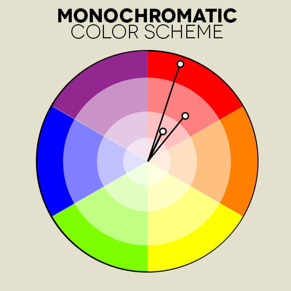
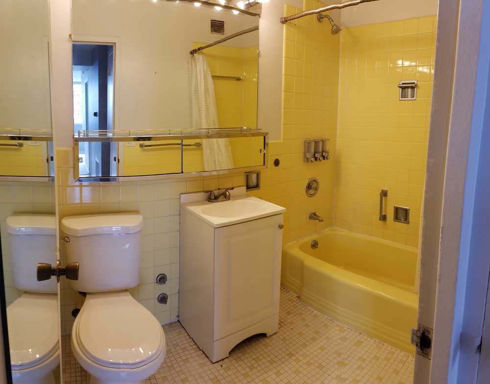
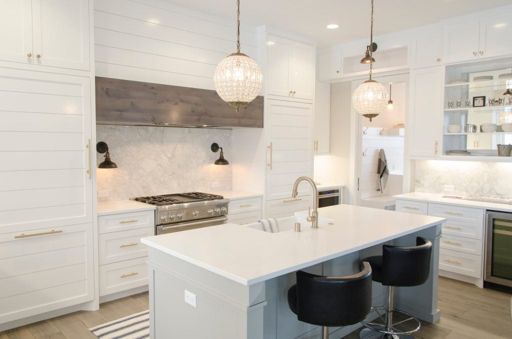
Photo by Aaron Huber on Unsplash 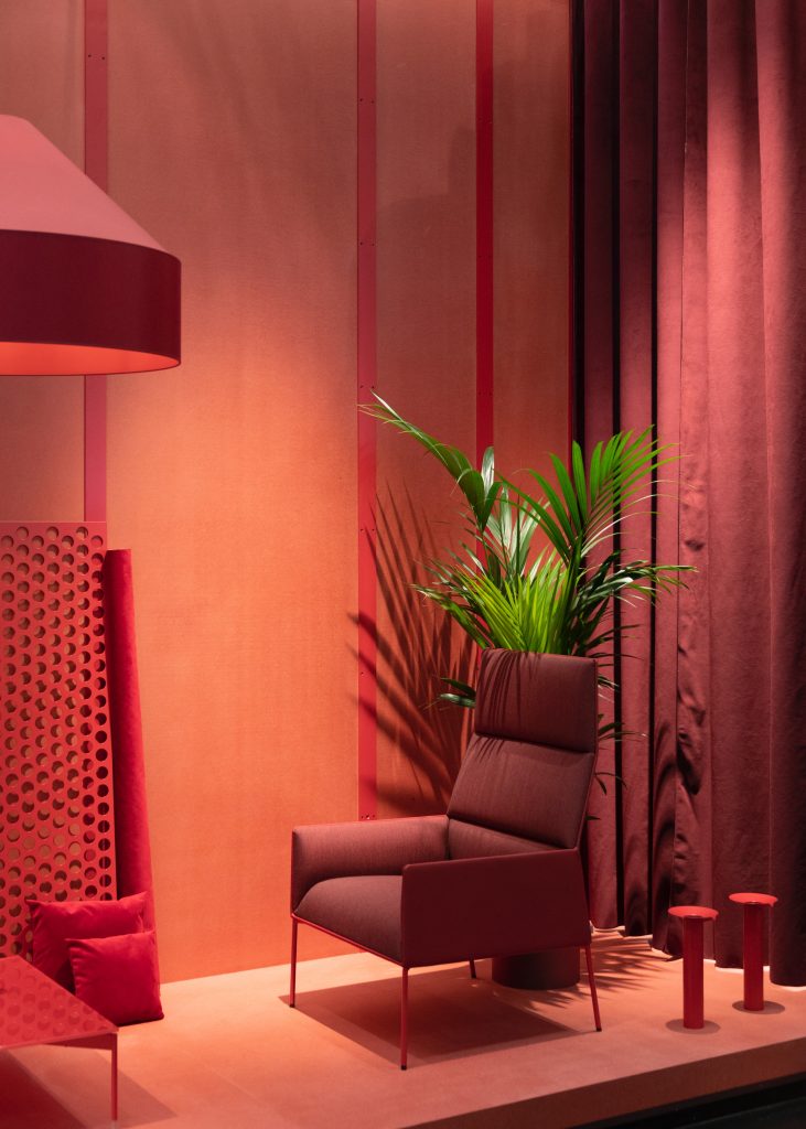
ANALOGOUS COLOR SCHEME
The use of colors close to each other on the color wheel
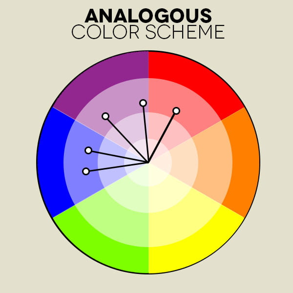
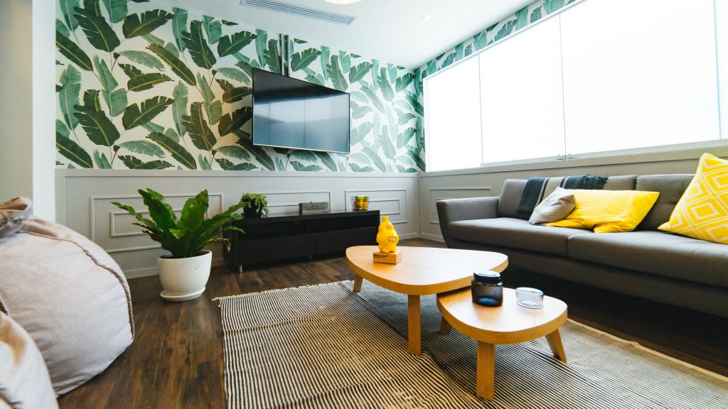
Photo by Dan Gold on Unsplash 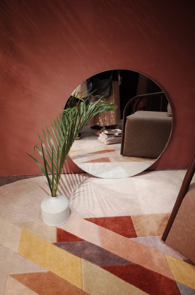
Photo by siyan peng on Unsplash 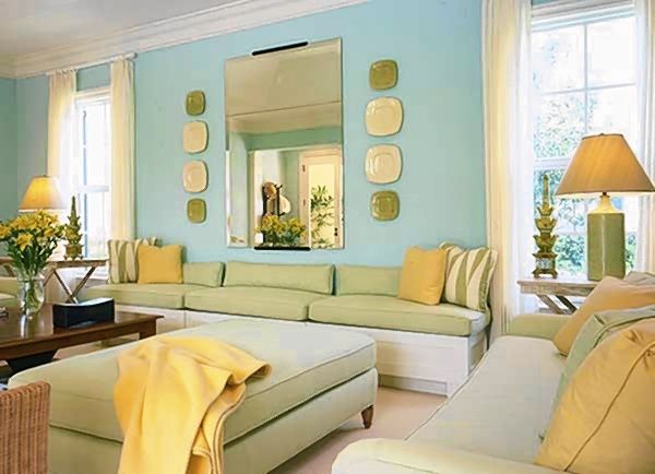
Pinterest
COMPLEMENTARY COLOR SCHEME
Complementary colors are those combining colors from opposite ends of the color wheel
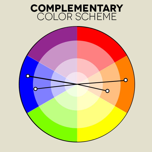
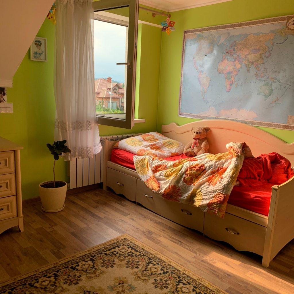
Photo by Evelin Susyk on Unsplash 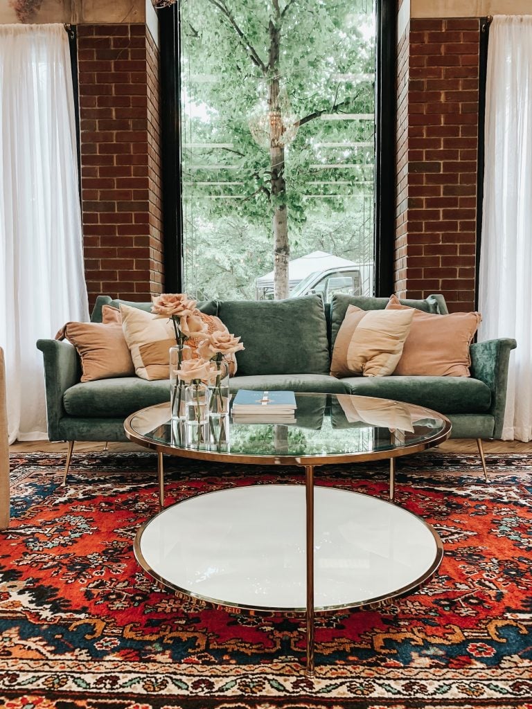
Photo by Derick McKinney on Unsplash 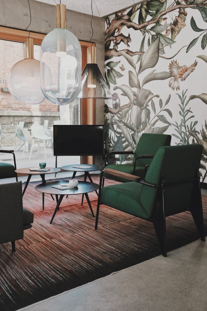
Photo by Thanos Pal on Unsplash
TRIAD COLOR SCHEME
The use of three equally spaced colors on the color wheel
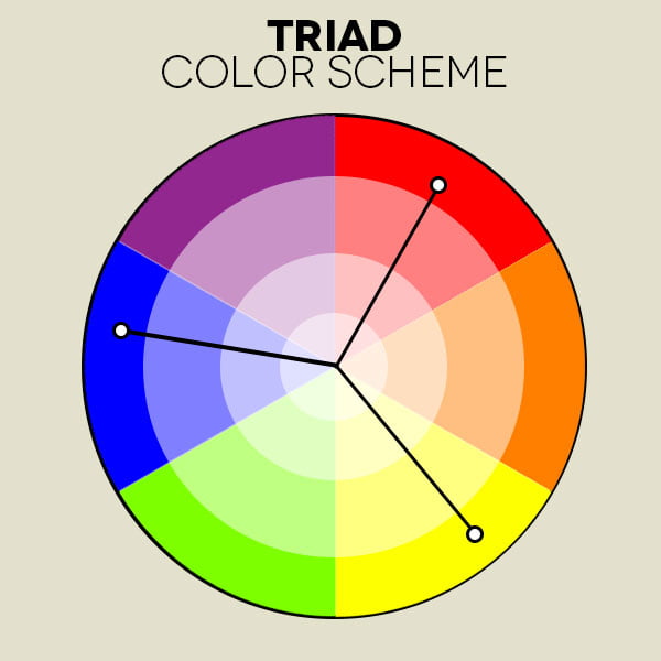
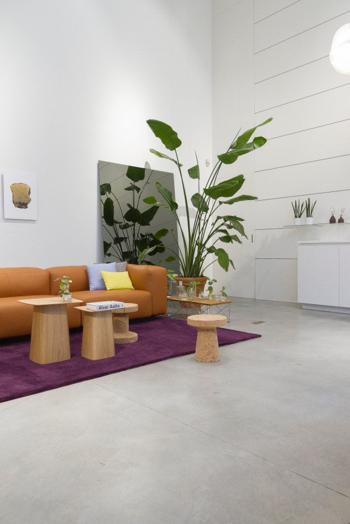
Photo by Jean-Philippe Delberghe on Unsplash 
Photo by Linh Le on Unsplash 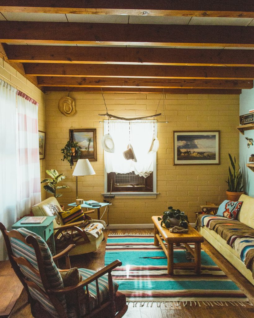
Photo by Dane Deaner on Unsplash
EFFECTS OF COLOR + LIGHT
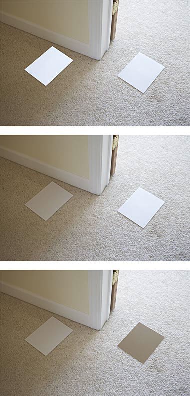
I came across this photo looking for an example of simultaneous contrast and figured I pretty much hit the jackpot! (Seriously, go check out this page for a bunch of really great information on color! So, what is simultaneous contrast, and, why is it important?
If we look at the three images, it’s important to note that the middle image is the original. The top image has copied over the color from the right paint swatch to the left, while the bottom image has copied over the color from the left paint swatch to the right.
Light has a huge impact on how we perceive color and it can go beyond how much light. An Interior Designer must also consider the light temperature of a space (how yellow or how blue the light is).
Do you ever struggle to choose a paint color for a room because of how the light affects it between day and night? Or, even on different walls of the room? Here are a few tips to remember when dealing with color and light differences:
- Color on a light background will appear darker
- Color on a dark background will appear lighter
- A neutral grey will appear warm when placed with cool colors (green, blue, purple)
- A neutral grey will appear cool when placed with warm colors (red, orange, yellow)
- Dark colors = smaller and heavier
- Light colors = cooler and lighter
I WANT TO HEAR FROM YOU!
- What other color tricks do you use?
- What are some good examples of the different color schemes you use in your home?
- What is your go-to color?
