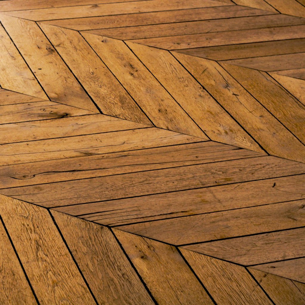
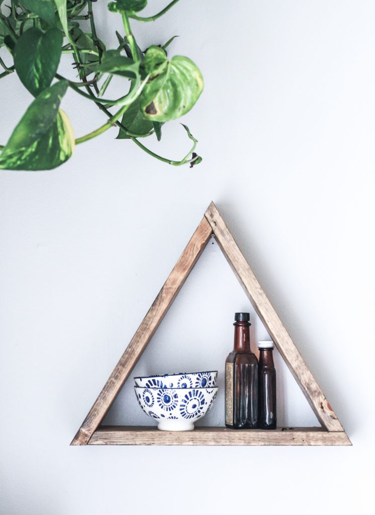
One of the most basic Elements of Design is form. Form is made up of points, lines, planes, volumes, and shapes; these then become the starting point to your design. When looking for a new home, or remodeling your current one, the form is one of the most important aspects to consider, but, can be manipulated through design and decoration.
“the shape and structure of something as distinguished from its material”
— Form. (n.d.). Retrieved December 27, 2015, from http://www.merriam-webster.com/dictionary/form
1 | Point
When we think of a “point” we generally think of a tiny dot, but really, this doesn’t have to be reduced to just small circles. A point can be any shape – what really matters is the relationship from the point to the background – your “point” should be very small in comparison to the rest of the space. So, let’s say you have a painting you are hanging on a wall at the end of a hallway. Once you hang the painting, you are only a few feet away from it, so, it doesn’t appear as a “point”. As you walk to the other end of the hall, the painting gets further away, and it’s relationship to the space around it dwarfs, causing it to appear as a point.
2 | Line
“: a long narrow mark on a surface
— Line. (n.d.). Retrieved December 27, 2015, from http://www.merriam-webster.com/dictionary/line
: a mark on the ground that shows the edge of the playing area in a sport
: an area or border that separates two places”
<
Line is a great way to think of an axis (you remember when your math teacher said you will always use this stuff, here is a great example). Whereas we can think of the “point” as the axis (the spot where X and Y meet), a line is the set of points between X and Y. It is important to remember that a line is where the length greatly exceeds the depth or width it may have.
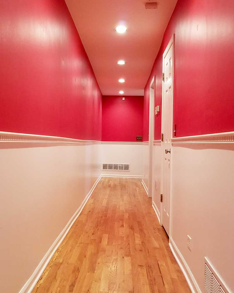
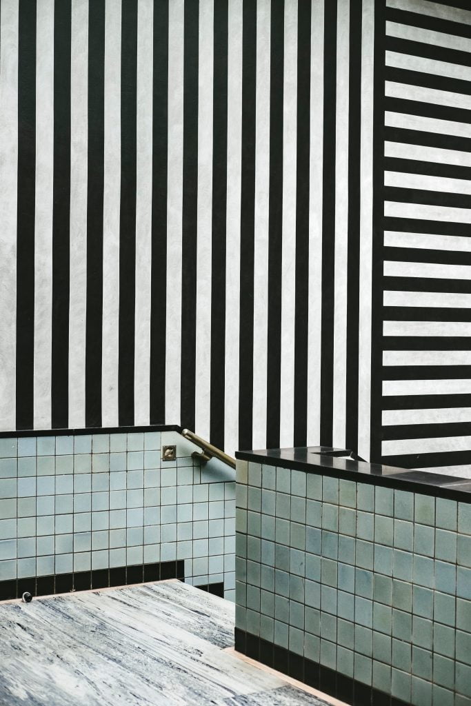
Or, take this photo of a hallway at Project Red. Due to the sharp contrast in paint at the wainscotting, the emphasis of line is accentuated.
Vertical Lines
Vertical lines promote strength, permanence, equilibrium, and a powerful upward movement. They also can make a space feel taller than it really is (similar to how vertical stripes in clothing can help to make you appear slimmer). Just be cautioned that sometimes these vertical lines can represent a jail cell feel depending on how wide and contrasted in color and could even affect your guests negatively of the contrast is too much. On the plus side, vertical lines are fantastic for wood graining. If you enjoy having wood cabinets in your kitchen, typically having the grain run vertically has a strong connection to the direction of plants growing.
Horizontal Lines
Horizontal lines seem to be quite the popular pick these days and with good reason. These lines are typically related to stability, restfulness, and related to the plane of the earth. A horizontal line can have the opposite effect as a vertical one in that it can create the illusion an object is longer, or wider than it really is, which is why it was so popular in the prairie style homes made famous by Frank Lloyd Wright.
Diagonal Lines
Diagonal patterns often represent movement and for today’s busy family, it seems as if the diagonal pattern (going upwards, downwards, or both) can easily flow with the business of our days.
Curved Lines
Curved lines are a fun one to talk about, mostly because of all the connections they have. A curved line can be anything from geometric shapes (like circles, ellipses, and arcs) to something a bit more free form. These types of lines can represent not only the forms from nature, but those from the human form.
3 | Plane
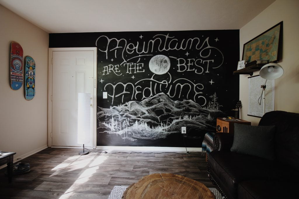
“a : a surface in which if any two points are chosen a straight line joining them lies wholly in that surface
— Plane. (n.d.). Retrieved December 27, 2015, from http://www.merriam-webster.com/dictionary/plane
b : a flat or level surface”
Plane is a great way to create depth and layering to a space. Planes can be seen from a perspective of walls, floors, ceilings, and even furniture. It’s with the use of planes and the addition of color, patterns, and texture, that we can create the character of a space.
4 | Volume
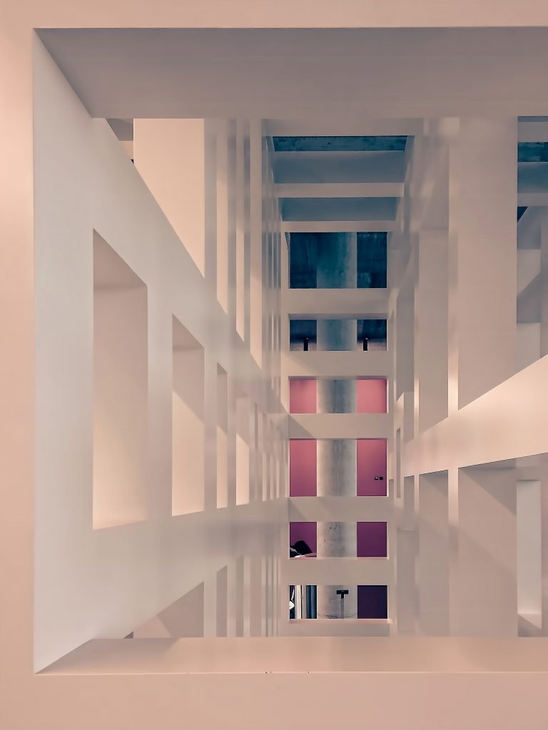
“the amount of space occupied by a three-dimensional object as measured in cubic units”
— Volume. (n.d.). Retrieved December 27, 2015, from http://www.merriam-webster.com/dictionary/volume</figcaption
Volume takes the idea of our X/Y axis – the plane – and brings in the ‘Z’ axis to create a more 3-dimensional object or space. One thing to remember is that volume can be either solids or voids – positive or negative space.
Many homeowners assume that by having a large home they automatically get the benefit of having large volumes of space, while a smaller home would mean volume is simply sparse. What people sometimes forget is how you use the space to create volume. Clutter is the main cause of visually shrinking a home or room, while the strategic placement of possessions and moments of pause can encourage visitors to navigate the space in a more pleasing manner. By combining the techniques described here, even a smaller family home or apartment could appear to have volume.
5 | Shape
“: to give a particular form or shape to (something) : to work with (a material) in order to make something from it
— Shape. (n.d.). Retrieved December 27, 2015, from http://www.merriam-webster.com/dictionary/shape</figcaption
: to influence the development of (something) : to help (something) become what it is
: to make (something, such as a plan) by a process of careful thought”
Shapes form when you distinct an object from adjacent spaces or objects. In the example image above, we can clearly distinguish the shape of a circle from the rest of the mirror design.
